Friday, May 12, 2017

Quantitative Methods: Assignment 6

Introduction

This assignment is designed to apply knowledge about regression analysis to real world scenarios.

Skills acquired and demonstrated in this assignment:

  • Running a regression in SPSS
  • Interpreting regression output and predicting results given data
  • Manupulating data in Excel and Join to ArcGIS
  • Mapping standardized residuals in ArcGIS
  • Connecting statistics and spatial outputs


In Part 1, a study on crime rates and poverty was conducted for Town X.  A local news station got a hold of some data and made a claim that as the number of kids that get free lunches increases, so does crime.  The goal is to run a regression equation with the given data to determine if the claim is correct.  Then a new area of town was identified as having a 23.5% free lunch level, and the corresponding crime rate must be calculated.

In Part 2, the City of Portland is concerned about adequate responses to 911 calls.  They are curious what factors might provide explanations as to where the most calls come from.  A company is interested in building a new hospital and they are wondering how large an ER to build and the best place to build it.  While an answer for the size of the ER can't be given using these methods, some ideas as to the influences related to more or less calls and possibly where to build the hospital can be provided.  The following data has been provided:

-Calls (number of 911 calls per census tract)
-Jobs
-Renters
-LowEduc (number of people with no High School degree)
-AlcoholX (alcohol sales)
-Unemployed (number of unemployed people)
-ForgnBorn (foreign born population)
-Median Income
-CollGrads (number of college grads)

    Step 1: Running Single Regression in SPSS
Three independent variables must be chosen to be analyzed using regressional analysis, with Calls being the dependent variable.  All information regarding relationships between these variables must be explained.

    Step 2: Choropleth Map and Residual Map
A map of the number of 911 calls per Census Tract must be created along with a standardized residual map of the variable found with the largest R Square value.

    Step 3: Multiple Regression
A multiple regression report must be run with all the variables listed above and determine if multicollinearity is present.  Then a step wise approach must be run with the results explained.


Important background information: 

Regression Analysis- a statistical tool used to investigate the relationship between two variables.
-it seeks to predict the effect of one variable to another, but unlike correlation it investigates causation.
-uses 2 variables, the independent variable (x) and the dependent variable (y).

Formula: y = a + bx
a = the constant
b = regression coefficient (slope).  Shows 1 unit of change in the dependent variable.  Gives direction of relationship between the two variables.


Ordinary Least Squares (OLS)- fitting a straight line through a set of points in such a way that the sum of the squared vertical distances from the observed points to the fitted line is minimized.  It is a trendline.

Coefficient of Determination (R Square)- illustrates how much x explains y.
-ranges from 0-1.  (0 is no strength and 1 is very strong)

Residual- the amount of deviation of each point from the best fit line.
-represents the difference between the actual and predicted value of y.

Standard Error of the Estimate (SEE)- the sum of the standard deviation of the residuals.
-another measurement of the accuracy of the regression line.
-smaller SEE indicates more accurate prediction.
-impacted by large outliers

Multiple Regression- uses more than one independent variable to explain the dependent variable.
-most widely used statistical method.
-shows relationships between variables as a plane (3D).

Formula: y = a + B1X1 + B2X2 ... BnXn
a = the constant
Bn = partial slope coefficients.  Shows the change in y associated with a one unit increase of X1 when the other independent variables are held constant.  Values for each Bn variable are the sum of squared deviations (residuals) from all points in order to minimize the distance from the plane.

Beta or Standardized Regression Coefficient- the average amount the dependent variable increases when the independent variable increases one deviation and the other independent variables are held constant.

Formula: Beta = bi(Sxi/Sy)
bi = B value
Sxi = the standard deviation of the particular independent variable
Sy = standard deviation of the dependent variable

Step Wise Regression- examines the contribution of each variable to the equation and adds the variable with greatest incremental contribution first.  Basically it sees which variables are the best ones to explain the dependent variable.  It will exclude variables that do not improve the equation.

Multicollinearity- occurs when two independent variables are highly correlated with one another.  Tends to make some independent variables not significant when they probably are significant.  Indicators include: Eigen values, condition index, and variance properties.

Eigen Values- conceptually represents the amount of variance accounted for.  Eigen values close to 0 mean multicollinearity may be present.

Condition Index- high condition indexes (over 30) are flags for multicollinearity.

Variance Properties (VP)- values that show which variables may be causing the problems.  Values close to 1 are the problem.  Eliminating the variable with the highest VP may fix problems.

Tolerence- MC exists if tolerance is below 0.1.

Variance Inflation Factors (VIF)- MC exists if VIF is greater than 10 or all factors on average are greater than 1.

Methods

Part 1

In SPSS, an Excel file was brought in and used to run a regression analysis.  The results were analyzed to determine if the claim was correct.  The new area of town statistic was entered into the regression equation to determine the corresponding crime rate.

Part 2

    Step 1: Running Single Regression in SPSS
Using Calls as the dependent variable, a regression analysis was run individually for these independent variables: Unemployed, Foreign Born Population, and Alcohol Sales.  The results of each of these were used to analyze the relationships that exist between these variables and 911 calls.

    Step 2: Choropleth Map and Residual Map
Using ArcMap, two maps were made: calls per census tract choropleth map and a map of the variable found with the largest R Square value, which was Foreign Born Population.  The residual shapefile was created by following "spatial statistics tool" - "modeling spatial relationships" - "ordinary least squares".  These maps were then used to make connections between the data and a spatial context.


    Step 3: Multiple Regression in SPSS
A multiple regression report was run with all the variables listed above.  Collinearity Diagnostics were turned on to determine if multicollinearity was present, and the results of the relationships were further analyzed.  Next a Stepwise approach was taken to put the variables in order from most to least important and the results were used to analyze the relationships present.  The most important variables were then mapped using ArcMap.


Results

Part 1
Figure 1: Results from the regression analysis performed to test the claim of the local news. 
  In this scenario, the number of kids that get free lunch is the independent variable (x) and the crime rate is the dependent variable (y).  The corresponding formula for the regression would be y = 21.819 + 1.685x.  What the regression statistics tells us is that there is a relationship between the number of kids that get free lunch and the crime rate, however the relationship is very weak.  The R Square value (ranges from 0-1) is low at 0.173.  Though we would reject the null hypothesis and say a relationship exists because the significance level is .005, which is below .01, it only suggests there is not much more than a hint of more kids getting free lunch causing crime rates to rise.  


  Based on the dataset, for the new area of town having a 23.5% free lunch, the corresponding crime rate would be 61.4.  This was calculated by using 23.5 as x in the formula: y = 21.819 + 1.685(23.5).  Confidence in this value is not very high however, because the Std. Error of the Estimate is high at 96.6072.  This means the data is not tightly distributed along the trend line, there is a lot of residual.  


Part 2

    Step 1: Running Single Regression in SPSS

Figure 2: Regression analysis results with Unemployed as the independent variable.
  Using unemployed as the independent variable, there is a positive relationship between unemployment and number of 911 calls.  The corresponding formula for this scenario is y = 1.106 + .507x.  This means if unemployed is increased by 1 unit of change, 911 calls will increase by 0.737 units.  The R Square value is 0.543, indicating the unemployed variable does a moderately good job at explaining 911 calls.  It is a strong predictor of calls, seeing as how the beta value is 0.737.  Because the significance level is less than .01, we reject the null hypothesis and say there is a relationship that exists between unemployment and number of 911 calls.


Figure 3: Regression analysis with Foreign Born Population as the independent variable.  
  Using foreign born population as the independent variable, there is a positive relationship between this and number of 911 calls.  The corresponding formula for this scenario is y = 3.043 + .080x.  This means if foreign born population is increased by 1 unit, 911 calls will increase by 0.80 units.  The R Square value is 0.552, indicating the foreign born population variable does a moderately good job at explaining 911 calls.  It is a strong predictor of calls, seeing as how the beta value is 0.743.  Because the significance level is less than .01, we reject the null hypothesis and say there is a relationship that exists between foreign born population and number of 911 calls.

Figure 4: Regression analysis results with Alcohol Sales as the independent variable.  
  Using alcohol sales as the independent variable, there is a positive relationship between alcohol sales and number of 911 calls.  The corresponding formula for this scenario is y = 9.59 + 0.00003069x.  This means if alcohol sales is increased by 1 unit of change, 911 calls will increase by 0.00003069 units.  The R Square value is 0.152, indicating alcohol sales does not do a very good job at explaining 911 calls.  It is a weak to moderate predictor of calls however, seeing as how the beta value is 0.390.  Because the significance level is less than .01, we reject the null hypothesis and say there is a relationship that exists between alcohol sales and 911 calls.

    Step 2: Choropleth Map and Residual Map

Figure 5: Choropleth map of 911 calls per census tract in Portland.  
  It can be observed that the tracts with the most 911 calls are mostly grouped together in the north-central portion of the city.  Tracts on the outer edges, especially in the southwestern portion of the city have much less calls.

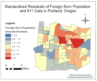
Figure 6: Residual map with Foreign Born Population as the independent variable and 911 Calls as the dependent variable.  
    Foreign Born Population was mapped because it showed the largest R Square value, or in other words it explained 911 calls the best out of the three variables tested.  What this map represents is each tract's location above, below, or near the best fit line of the regression analysis between Foreign Born Population and 911 Calls.  Dark blue tracts had much less 911 calls than predicted based on Foreign Born Population and dark red tracts had much more 911 calls than predicted based on Foreign Born Population.  A pattern shows in the map compared to the basic choropleth of 911 calls per tract, with some red concentrated near the north-central part of the city and some blue scattered around the edges of the city.  What this shows is that Foreign Born Population does have a spatial relationship with 911 calls, but it can not explain it completely.

    Step 3: Multiple Regression


Figure 7: Multiple regression analysis results using all the variables listed above as independent variables with Calls as the dependent variable.  
  The results show that with all the variables in the equation, Low Education is influencing 911 Calls the most, because the beta for that variable is much higher than all the others at 0.614.  The results also show that multicollinearity does exist between some variables.  Variables with variance proportions close to one may be causing problems.  Tolerance values below 0.1 also mean that multicollinearity does exist for that variable.  With this knowledge we can see that Alcohol Sales and College Grads have some multicollinearity.


Figure 8: Results from the stepwise regression analysis showing Renters, Low Education, and Jobs as the three variables that best explain 911 Calls.  
  The results show that between these three independent variables, they can explain 911 calls fairly well with an adjusted R Square value of 0.771.  Renters is the most important variable, because the analysis set it as the first variable in the equation.

Figure 9: Residual map with 911 Calls as the dependent variable and Renters, Low Education, and Jobs as the independent variables.  
  This map shows the census tracts standard residual value for Portland.  Similar to the previous map, there is a concentration of high standard residuals near the central portion of the city, and around the edges of the city there is the opposite.  Areas with dark red had significantly more 911 calls than predicted, and areas with dark blue had significantly less calls than predicted.


Conclusion
  Based on the results of the regression analysis' performed for all the variables provided, and the maps created including residuals, a good suggestion for a place to put a hospital would be in the dark red area in the residual map (Figure 9), or in the concentration of red tracts.  The stepwise approach indicated that renters, low education, and jobs were the variables that best explained 911 calls.  These predictions are not perfect, but they do a fairly good job at explaining where 911 calls come from.


Sources
Maps made in ArcMap
Statistics done in SPSS


Tuesday, April 25, 2017

Quantitative Methods: Assignment 5

Correlation and Spatial Autocorrelation

Introduction:

This assignment incorporated learning and applying the following skills:
  • Run Correlations in SPSS
  • Interpret Correlation from a Scatterplot and SPSS Output
  • Use the U.S. Census Site to Download Data and Shapefiles 
  • Identify GEOIDs from the Census Data
  • Join U.S. Census Data and other Data
  • Create a report connecting all the data
In Part 1, the goal was to learn to create a correlation matrix in SPSS in order to analyze correlations between variables in a dataset.  The case study area for this part was Milwaukee, Wisconsin.  The data included race, economic, and occupation variables.  

In Part 2, the goal was to analyze patterns of the presidential elections from 1980 and 2016 from data given by the Texas Election Commission (TEC).  The TEC wants to determine if there are clustering of voting patterns in the state, as well as voter turnout, so that it can provide the information to the governor to see if election patterns have changed or not over 36 years.

Important terms:
Spatial Autocorrelation - correlation of a variable with itself through space.  If there is some systematic pattern in the spatial distribution of a variable, it is said to be spatially autocorrelated.

Moran's I - is used to compare the value of the variable at any one location with the value at all other locations.  It creates a chart that displays spatial autocorrelation.  

Local Indicators of Spatial Autocorrelation (LISA) - a map providing a spatial component of spatial autocorrelation that uses spatial weights to determine clustering.  Any colors on the LISA map are significant (p=0.05).

Methods:

Part 1:
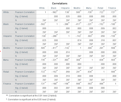
Using SPSS, a correlation matrix was created from an excel file containing the data.  The chart in Figure 1 could then be analyzed to recognize any patterns in the data.

Part 2:
The first step in this part was to download the Texas shapefile from the U.S. Census, along with Hispanic data.  Once downloaded, the Hispanic data and voting data were joined to the Texas shapefile.  The shapfile was then exported so that it could be opened in Geoda.  In Geoda, a spatial weight was created because there is spatial autocorrelation for both elections, voter turnout, and hispanic populations.  Next a Moran's I and LISA Cluster Map were created for voter turnout for both elections and percent democratic vote for both elections.  Figures 2, 4, 6, and 8 show the Moran's I charts and Figures 3, 5, 7, and 9 show the corresponding LISA Cluster Maps.  These were then used to analyze patterns in the Texas elections in 1980 and 2016.


Results:

Part 1:
Figure 1
Through analyzing the results from the correlation matrix, it can be observed that in Milwaukee, white populations have the strongest positive correlations with:  
-median household income – moderate correlation
·         -number of manufacturing employees – high correlation
·         -number of retail employees – high correlation
·         -number of finance employees – high correlation

What this means is that where there are higher populations of white people, these traits tend to be higher.  This means that whites hold most of the jobs and tend to have a higher median household income.  It should also be noted that in Milwaukee, black populations have all negative correlations with:
·         -median household income – low correlation
·        - number of manufacturing employees – little if any correlation
·         -number of retail employees – little if any correlation
·         -number of finance employees – little if any correlation


Though none of these are more than a low correlation, it can be compared to the same statistics for the white populations.  Just the fact that all these have a slightly negative correlation shows that where there are higher populations of black people, the median household income may tend to be lower, and they do not hold as many jobs as white people.  


Part 2:

Figure 2: Voter Turnout 1980
This chart shows that there was some positive spatial autocorrelation of voter turnout in the 1980 presidential election.
Figure 3: Voter Turnout 1980 LISA
It can be observed that voter turnout was low in the southern portion of the state, as well as in a cluster of counties on the eastern portion of the state.  Voter turnout was higher in the northern portion of the state, as well as in clusters near the center of the state.
Figure 4: Voter Turnout 2016
This chart shows that there was still some positive spatial autocorrelation of voter turnout in the presidential election in 2016, though it decreased since the 1980 election.
Figure 5: Voter Turnout 2016 LISA
It can be observed that voter turnout was lower in the southern portion of the state, just as in 1980, however there are now no counties on the eastern side of the state that had a significantly low voter turnout.  There are now a few counties scattered throughout the northwest and central portion of the state.  The state had a noticeable change in counties with high voter turnout; there are nearly half as many counties with a significantly high voter turnout.
Figure 6: Percent Democrat 1980
This chart shows that there was a positive spatial autocorrelation of the percent democratic vote in the 1980 presidential election.
Figure 7: Percent Democrat 1980 LISA
The west-central and north-western part of the state had a large area with a significantly low percent democratic vote.  The southern portion of the state saw a large area with a high percent democratic vote, as well as a few counties on the eastern side of the state.
Figure 8: Percent Democrat 2016
This chart shows that there was a positive spatial autocorrelation of percent democratic vote in the 2016 presidential election, and it was an increase from the 1980 election.
Figure 9 Percent Democrat 2016 LISA
The area of the low percent democratic vote shifted to the center and the north part of the state, while the southern portion of the state stayed about the same with a high percent democratic vote.  Now however, there is only one county near the eastern side of the state with a high percent democratic vote.  The western side of the state gained a handful of counties with a significantly high percent democratic vote.


Conclusion:
There is observable clustering of voting patterns in both the 1980 and 2016 presidential elections in the state of Texas.  These patterns have also changed over the course of 36 years.  In general, the southern portion of the state has had a lower voter turnout with a high percent democratic vote, and the northern portion of the state has had a higher voter turnout with a low percent democratic vote.  The Moran's I charts show that spatial clustering occurred in all the elections in both voter turnout and counties with high or low percent democratic vote.  The clustering was more prevalent in using the percent democratic vote variable, and this is also visible in the LISA maps.  This study truly helped display Tobler's Law (the first law of geography): everything is related to everything else, but near things are more related than distant things.


Sources:

-Data acquired from the U.S. Census Bureau and voting data acquired from instructor
-ArcMap used to join tables to shapefile
-Geoda was used to create Moran's I and Lisa Cluster Maps
-IBM SPSS Statistics 24 used to create correlation matrix

Wednesday, April 5, 2017

Quantitative Methods: Assignment 4

Introduction
The purpose of this lab is to practice determining whether there is a difference between a sample set of data and a hypothesized set of data.  This is done using the steps of hypothesis testing to conclude whether to reject the null hypothesis (there is a difference), or to fail to reject the null hypothesis (no difference).  This will then be put into context by using real U.S. Census data to determine whether or not a difference in average house value exists between the City of Eau Claire and the County of Eau Claire as a whole.

Objectives:
      -Distinguish between a z or t test
-Calculate a z and t test
-Use the steps of hypothesis testing
-Make decisions about the null and alternative hypotheses
-                    -Utilize real-world data connecting stats and geography


Methodology
Part I: hypothesis testing, z tests and t tests

1)
Using the given data of the interval type, confidence level, and the number of observations (n), the task was to fill in the correct corresponding values for the rest of the chart in Figure 5.  This was done using the t and z test tables, as well as the formulas for the z and t test equations (Figures 1 & 2).

The interval type and confidence level are used to determine a.  One tailed interval types take the difference between 100 and the confidence level to give you "a" as a percent.  Two tailed interval types take the difference between 100 and the confidence level and divide that number by 2 to give you "a" as a percent.  If n is less than 30, it uses a t test, and n is more than 30 it uses a z test.  The z or t value is then acquired by using either the z or t charts (Figures 3 & 4).

Figure 1

Figure 2

Figure 3


Figure 4


2)
A Department of Agriculture and Live Stock Development organization in Kenya estimate that yields in a certain district should approach the following amounts in metric tons (averages based on data from the whole country) per hectare: groundnuts. 0.57; cassava, 3.7; and beans, 0.29.  A survey of 23 farmers had the following results: 
                                                     Î¼             σ          mh             t                 probability
                Ground Nuts      0.52        0.3        
                Cassava              3.3          .75        
                Beans                 0.34        0.12      

The goal in this section was to:
    a) test the hypothesis for each product, assuming that each is a two tailed interval type with a                   confidence level of 95%,
    b) present the null and alternative hypotheses as well as conclusions
    c) determine the probability values of each crop
    d) examine the similarities and differences in the results

The results for this section are in Figure 5.


3)
A researcher suspects that the level of a particular stream’s pollutant is higher than the allowable limit of 4.2 mg/l.  A sample of n= 17 reveals a mean pollutant level of 6.4 mg/l, with a standard deviation of 4.4.  It is assumed that a one tailed test with a 95% significance level with be used to follow the hypothesis testing steps.  The corresponding probability value as well as the conclusion is detailed in Figure 6. 

Steps in Hypothesis Testing:
    1) State the null hypothesis, Ho
    2) State the alternative hypotheses, Ha
    3) Choose a statistical test
    4) Choose a or the level of significance
    5) Calculate test statistic
    6) Make decision about the null and alternative hypotheses


Part II: Study Question
The objective in this part was to use two shapefiles to compare the average house values per block group in the City of Eau Claire and in Eau Claire County as a whole.  Using a significance level of 95% and a one tailed interval type, a z test was used from statistics in the attribute tables to see if a difference existed between the city and the county as a whole.  Then a map was created in Arcmap to display the average house values per block group.  The results for this part are in Figure 7.  


Results

Figure 5
  • a - significance level
  • z or t - which type of test 
  • z or t - critical value for the given significance level


                                                    Î¼             σ          mh             t                 probability
                Ground Nuts      0.52        0.3        0.57      -0.79936          21.19%
                Cassava              3.3          .75        3.7         -2.5577             0.52%
                Beans                 0.34        0.12      0.29        1.9984            97.72%
Figure 6
    Figure 6 shows the calculations made in t tests to determine the difference between the yields of the sample and the estimated values from the Department of Agriculture and Live Stock Development organization in Kenya.  The conclusion is that ground nuts and beans showed no difference, while cassava did show a difference.  In the ground nuts and beans calculations, the test result was to fail to reject the null hypothesis.  In the cassava calculations, the test result was to reject the null hypothesis.  


                                                  Î¼             σ          mh             t                 probability
         Stream Pollution     6.4           4.4       4.2             2.0615         98.03%
Figure 7
    Figure 7 shows the calculations made in a t test to determine if there was a significant difference between the allowable pollution level and the recorded level of the observed stream.  The corresponding t test determined that there was a difference, because the result was to reject the null hypothesis.  


Figure 7
n: 53
City Mean: 151876.51
County Mean: 169438.13
Standard Deviation (City): 49706.92


    This map helps to show how the City of Eau Claire has a large number of block groups with low average home values.  Using a one tailed interval type with a 95% significance level, a z test was used to calculate the result: a failure to reject the null hypothesis.  This means that there is not a difference using a one tailed interval type.  There is not a difference in the average house value in the City of Eau Claire compared to the County of Eau Claire.  However, if a two tailed interval type was used in the z test, the null would be rejected because the average house value in the City of Eau Claire is significantly less than that of the county as a whole.


Conclusion
Each value in the data used for hypothesis testing will influence the result of z and t tests.  They are used to determine whether or not there is a difference between the sample mean of a set of data and the hypothesized (set) mean.  The conclusion from Figure 7 shows how even choosing whether or not a one or two tailed test will influence the end result.


Thursday, March 9, 2017

Quantitative Methods: Assignment 3

Assignment 3


Introduction
      The objective of this project was to investigate foreclosures in Dane County, WI in 2011 and 2012. Though the data did not provide specific reasons for the foreclosures, they could still be analyzed spatially.  Patterns could be determined by looking at how each tract changed in number of foreclosures from 2011 to 2012.  By understanding the foreclosure data distribution for the year of 2012, probabilities could then be used to estimate what the distribution would likely be for 2013.  

Methodology
Definitions: 
Z-score - the number of standard deviations a particular observation is away from the mean.  
Probability - the chance (in ration form) that an outcome will occur.  

The z-scores were taken from 3 census tracts in Dane County for both 2011 and 2012 to look at changes in those specific counties.  The first step in mapping the changes was to add a field that shows the change between 2011 and 2012.  The field calculator was used to calculate the difference between numbers of foreclosures for the two years.  This field was then mapped to display the results: which tracts increased in number of foreclosures and which tracts had a decrease in number of foreclosures, and by how much did each tract increase or decrease.  

Next, the probability of what would likely occur in 2013 was determined by using the z-score equation with the 2012 data.  A z-score chart was used to find what number of foreclosures would be exceeded 70% of the time and 20% of the time in 2013.  
Another way to estimate the number of foreclosures in 2013 would be to look at the total number (sum) of foreclosures of the years 2011 and 2012, and however it changed for those years could be applied to how it might change for 2013.  

Results
By looking at Figure 1, it can be seen which tracts had an increase or decrease in number of foreclosures.  With the city of Madison being the centrally concentrated area of Dane County, it can be observed that that area generally didn't have drastic changes in the number of foreclosures from 2011 to 2012.  Some very large tracts on the East and West of Madison had large increases in foreclosures, and a couple very large tracts on the East and North edges of Madison showed large decreases in foreclosures.  
Figure 1
In 2013 the number of foreclosures that would be exceeded by 70% is 7.1477.  The number of foreclosures that would be exceeded by 20% is 20.6203.  What these probabilities mean is that 70% of the tracts in Dane County would have more than 7 foreclosures, and 20% of the tracts would have more than 20 foreclosures.

By also taking the total number of foreclosures in 2012 and subtracting the total number of foreclosures in 2012, it can be observed that the total increased by 997 in 2012.  If this increase trend continued to 2013, that year would see 2313 total foreclosures in Dane County.

Conclusion
2012 saw an increase in total number of foreclosures, and if that trend continues 2013 will see another increase in foreclosures for Dane County.  It was also observed that 80% of tracts in the county will have 20 or less foreclosures, and 30% will have 7 foreclosures or less.  By using the map in Figure 1, the tracts that had large increases in the number of foreclosures could be targeted in focusing resources to try to reduce the number of foreclosures, or at least search for possible causes of the increases.  The tracts that showed large decreases in number of foreclosures could be studied to try to find reasons for the decrease so that could be applied to areas that had large increases.  The results from this county could also be compared to other counties in Wisconsin to see where this county lies in regards to the rest of the state.  

Tuesday, February 21, 2017

Quantitative Methods: Assignment 2

Part 1 - Hand Calculations of Data

Definitions:

Range – The difference between the highest value and the lowest value in the dataset. 

Mean (average) – The sum of all the observations divided by the total number of observations.

Median – If each observation was listed in order from least to greatest, the median is the observation 
in the middle, or halfway in the list. 

Mode – The value that occurs the most. 

Kurtosis – Refers to how steep or flat the distribution of the data is.  In other words, kurtosis describes if the data is bunched together around one value or if it is spread out among a broader range of values.  Positive kurtosis (leptokurtic) means the distribution is peaked.  Negative kurtosis (platykurtic) means the distribution is flat. 

Skewness – Describes how evenly distributed the data is on either side in relation to the mean.  Acceptable skewness is typically between -1 and 1, with 0 being no skewness. 

Standard Deviation – A statistic that describes how closely the observations are distributed to the mean of the data.  About 68% of the data will fall within 1 standard deviation from the mean.  About 95% of the data will fall within 2 standard deviations from the mean.  About 99% of the data will fall within 3 standard deviations from the mean.  This statistic varies in different datasets because the data and number of observations varies, but the 1st, 2nd, and 3rd deviations will always fall approximately within the 68%, 95%, and 99% ranges. 

Team ASTANA
Range: 70 min (1 hour 10 min)
Mean: 2276.667 min (37 hours 56.4 min)
Median: 2280 min (38 hours)
Mode: 2270 min and 2280 min (37 hours 50 min & 38 hours)
Kurtosis: 1.168
Skewness: -0.00257
Standard Deviation: 17.211 min

Team TOBLER
Range: 31 min
Mean: 2285.467 min (38 hours 5.4 min)
Median: 2289 min (38 hours 9 min)
Mode: 2289 min (38 hours 9 min)
Kurtosis: 2.927
Skewness: -1.5635
Standard Deviation: 7.891 min

When looking at the race data from each team, it is apparent that the safe choice would be to invest in Team ASTANA.  Not only does Team ASTANA have the three fastest racers, but they also have a team average time that is faster than Team TOBLER by 9 minutes.  We can see that Team TOBLER has a smaller range and a much lower standard deviation, meaning there are no riders that are much faster or much slower than the rest of the team.  Though Team TOBLER has a solid group of riders that are all relatively fast, they don’t seem to have much of a chance at clinching 1st place for both the individual and team categories.  

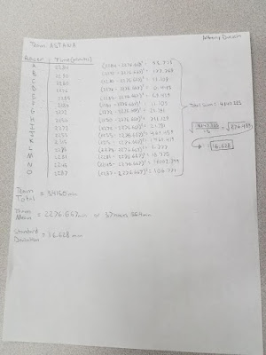
Figure 1 shows the calculations made by hand for the standard deviation for Team ASTANA and Figure 2 shows the calculations made by hand for the standard deviation for Team TOBLER.
Figure 1

Figure 2


Part 2 - Calculating Mean Centers and Weighted Mean Centers

Figure 3
The three points mapped in Figure 3 are the geographic mean center of Wisconsin, the weighted geographic mean center of Wisconsin based on population from the years 2000 and 2015.  The geographic mean center of Wisconsin simply takes the shape of Wisconsin as a whole and finds the center of it.  The weighted geographic mean center of Wisconsin based on population is calculated using data that represents population spatially and in concentrations, and a center point is calculated based on that data.  The weighted geographic mean center of population shows that most people live in Southeastern Wisconsin, compared to the geographic mean center for the entire state.  The shift in population centers shows that more people are living in Western Wisconsin in 2015 than 2000.  There are several possible causes of this slight migration, or shift in population from east to west.  It could be possible that cities in Western Wisconsin are expanding and becoming more economically promising.  It could also be possible that suburbs of Milwaukee are expanding, meaning that populations wouldn't be based to the extreme southeast corner of Wisconsin, but just a little further west.  Whatever the root cause of this geographic population shift, it will be interesting to see where the weighted geographic mean center based on population changes for Wisconsin in the next 15 years and beyond.  


Thursday, February 2, 2017

Quantitative Methods: Assignment 1

Part 1

Nominal Data: Each unit of data is unique and does not have a numerical value.  These values are each given names in order to differentiate between them.  Some examples could be things like building type, vegetation type, country, etc.  The colors on the map are somewhat arbitrary and don’t have a clearly organized scale, rather there is a variety of colors just to recognize the differences between them.  In Figure 1, the colors in the map are used simply to differentiate between each type of church that is popular in that area.  The colors aren’t meant to represent some sort of scale, just each unique church type. 
Figure 1


Ordinal Data: This type of data places values in a certain order, ranked from either least to greatest or greatest to least.  Often times choropleth maps use ordinal data because they can easily use a color scale to display values in order.  In Figure 2, the author of the map used a color scale ranging from light to dark to represent places based on completeness of published architectural work. 
Figure 2


Interval Data: Continuous data is used in interval data classification.  This can be used to show differences between data values, but the interval size between values is fixed.  With interval data, a “zero” doesn’t really mean anything, it is just an arbitrarily chosen point of reference.  An example of this could be the timeline we use in history.  It is currently 2017, but humans have been around for tens of thousands of years, or more.  We chose the year Jesus Christ was born to start the common era at year 1, and anything before that is “BC” or “BCE”, and anything after that has the label “AD”.  The year zero wasn’t the first ever known year, it was just chosen as a reference point.  Figure 3 is a good example of a map using interval data.  Temperature does not have a natural zero, because there can be negative temperatures. 
Figure 3


Ratio Data: This type of data also uses continuous data, but a natural zero does exist.  This allows magnitude and comparisons to be made with different values.  This data can be mapped in several ways; choropleth maps and graduated or proportional symbol maps are common ways to map ration data.  Figure 4 shows how a symbolized map can accurately represent ratio data. 
Figure 4


Part 2

Classification Methods:

Equal Interval based on Range (MAP 1) - Each class has an equal range. 

Natural Breaks (MAP 2) - An equation is used to break the classes up by where the largest groups happen to fall in the data. 

Quantile (MAP 3) - Each class has the same number of values within it. 
Figure 5

In my opinion, the agricultural consulting company should use MAP 2 to be presented to potential clients for the purpose of increasing the number of women as the principal operator of a farm.  This map uses the natural breaks classification method in order to best display where the most female operated farms are located, as well as where they are not common.  MAP 1 which used the equal interval classification method didn’t display the information in a helpful manner because it shows almost all of the state being scarcely populated with female operated farms.  Only one county is in the highest classification, making the map too generalized.  MAP 3 does do a nice job of displaying where female operated farms are most prominent as well as where they are lacking, so it would be my second choice to show potential clients.  However, with the highest and lowest classes varying so much in range, I feel that a map with classes somewhere in the middle ground between MAP 1 and MAP 3 would be the best choice.  MAP 2 highlights just a handful of counties as containing the highest number of female operated farms while showing quite a few more areas that are lacking in female operated farms.  The entire northern part of the state could be targeted for marketing of female operated farms as well as small pockets around the state that are also lacking.  And even if the agricultural consulting company decided they wanted to target areas where female operated farms are already more popular, they could use this map to find the top 5 counties to target for that approach.