Tuesday, April 25, 2017

Quantitative Methods: Assignment 5

Correlation and Spatial Autocorrelation

Introduction:

This assignment incorporated learning and applying the following skills:
  • Run Correlations in SPSS
  • Interpret Correlation from a Scatterplot and SPSS Output
  • Use the U.S. Census Site to Download Data and Shapefiles 
  • Identify GEOIDs from the Census Data
  • Join U.S. Census Data and other Data
  • Create a report connecting all the data
In Part 1, the goal was to learn to create a correlation matrix in SPSS in order to analyze correlations between variables in a dataset.  The case study area for this part was Milwaukee, Wisconsin.  The data included race, economic, and occupation variables.  

In Part 2, the goal was to analyze patterns of the presidential elections from 1980 and 2016 from data given by the Texas Election Commission (TEC).  The TEC wants to determine if there are clustering of voting patterns in the state, as well as voter turnout, so that it can provide the information to the governor to see if election patterns have changed or not over 36 years.

Important terms:
Spatial Autocorrelation - correlation of a variable with itself through space.  If there is some systematic pattern in the spatial distribution of a variable, it is said to be spatially autocorrelated.

Moran's I - is used to compare the value of the variable at any one location with the value at all other locations.  It creates a chart that displays spatial autocorrelation.  

Local Indicators of Spatial Autocorrelation (LISA) - a map providing a spatial component of spatial autocorrelation that uses spatial weights to determine clustering.  Any colors on the LISA map are significant (p=0.05).

Methods:

Part 1:
Using SPSS, a correlation matrix was created from an excel file containing the data.  The chart in Figure 1 could then be analyzed to recognize any patterns in the data.

Part 2:
The first step in this part was to download the Texas shapefile from the U.S. Census, along with Hispanic data.  Once downloaded, the Hispanic data and voting data were joined to the Texas shapefile.  The shapfile was then exported so that it could be opened in Geoda.  In Geoda, a spatial weight was created because there is spatial autocorrelation for both elections, voter turnout, and hispanic populations.  Next a Moran's I and LISA Cluster Map were created for voter turnout for both elections and percent democratic vote for both elections.  Figures 2, 4, 6, and 8 show the Moran's I charts and Figures 3, 5, 7, and 9 show the corresponding LISA Cluster Maps.  These were then used to analyze patterns in the Texas elections in 1980 and 2016.


Results:

Part 1:
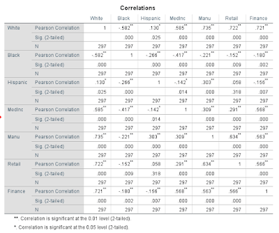
Figure 1
Through analyzing the results from the correlation matrix, it can be observed that in Milwaukee, white populations have the strongest positive correlations with:  
-median household income – moderate correlation
·         -number of manufacturing employees – high correlation
·         -number of retail employees – high correlation
·         -number of finance employees – high correlation

What this means is that where there are higher populations of white people, these traits tend to be higher.  This means that whites hold most of the jobs and tend to have a higher median household income.  It should also be noted that in Milwaukee, black populations have all negative correlations with:
·         -median household income – low correlation
·        - number of manufacturing employees – little if any correlation
·         -number of retail employees – little if any correlation
·         -number of finance employees – little if any correlation


Though none of these are more than a low correlation, it can be compared to the same statistics for the white populations.  Just the fact that all these have a slightly negative correlation shows that where there are higher populations of black people, the median household income may tend to be lower, and they do not hold as many jobs as white people.  


Part 2:

Figure 2: Voter Turnout 1980
This chart shows that there was some positive spatial autocorrelation of voter turnout in the 1980 presidential election.
Figure 3: Voter Turnout 1980 LISA
It can be observed that voter turnout was low in the southern portion of the state, as well as in a cluster of counties on the eastern portion of the state.  Voter turnout was higher in the northern portion of the state, as well as in clusters near the center of the state.
Figure 4: Voter Turnout 2016
This chart shows that there was still some positive spatial autocorrelation of voter turnout in the presidential election in 2016, though it decreased since the 1980 election.
Figure 5: Voter Turnout 2016 LISA
It can be observed that voter turnout was lower in the southern portion of the state, just as in 1980, however there are now no counties on the eastern side of the state that had a significantly low voter turnout.  There are now a few counties scattered throughout the northwest and central portion of the state.  The state had a noticeable change in counties with high voter turnout; there are nearly half as many counties with a significantly high voter turnout.
Figure 6: Percent Democrat 1980
This chart shows that there was a positive spatial autocorrelation of the percent democratic vote in the 1980 presidential election.
Figure 7: Percent Democrat 1980 LISA
The west-central and north-western part of the state had a large area with a significantly low percent democratic vote.  The southern portion of the state saw a large area with a high percent democratic vote, as well as a few counties on the eastern side of the state.
Figure 8: Percent Democrat 2016
This chart shows that there was a positive spatial autocorrelation of percent democratic vote in the 2016 presidential election, and it was an increase from the 1980 election.
Figure 9 Percent Democrat 2016 LISA
The area of the low percent democratic vote shifted to the center and the north part of the state, while the southern portion of the state stayed about the same with a high percent democratic vote.  Now however, there is only one county near the eastern side of the state with a high percent democratic vote.  The western side of the state gained a handful of counties with a significantly high percent democratic vote.


Conclusion:
There is observable clustering of voting patterns in both the 1980 and 2016 presidential elections in the state of Texas.  These patterns have also changed over the course of 36 years.  In general, the southern portion of the state has had a lower voter turnout with a high percent democratic vote, and the northern portion of the state has had a higher voter turnout with a low percent democratic vote.  The Moran's I charts show that spatial clustering occurred in all the elections in both voter turnout and counties with high or low percent democratic vote.  The clustering was more prevalent in using the percent democratic vote variable, and this is also visible in the LISA maps.  This study truly helped display Tobler's Law (the first law of geography): everything is related to everything else, but near things are more related than distant things.


Sources:

-Data acquired from the U.S. Census Bureau and voting data acquired from instructor
-ArcMap used to join tables to shapefile
-Geoda was used to create Moran's I and Lisa Cluster Maps
-IBM SPSS Statistics 24 used to create correlation matrix

Wednesday, April 5, 2017

Quantitative Methods: Assignment 4

Introduction
The purpose of this lab is to practice determining whether there is a difference between a sample set of data and a hypothesized set of data.  This is done using the steps of hypothesis testing to conclude whether to reject the null hypothesis (there is a difference), or to fail to reject the null hypothesis (no difference).  This will then be put into context by using real U.S. Census data to determine whether or not a difference in average house value exists between the City of Eau Claire and the County of Eau Claire as a whole.

Objectives:
      -Distinguish between a z or t test
-Calculate a z and t test
-Use the steps of hypothesis testing
-Make decisions about the null and alternative hypotheses
-                    -Utilize real-world data connecting stats and geography


Methodology
Part I: hypothesis testing, z tests and t tests

1)
Using the given data of the interval type, confidence level, and the number of observations (n), the task was to fill in the correct corresponding values for the rest of the chart in Figure 5.  This was done using the t and z test tables, as well as the formulas for the z and t test equations (Figures 1 & 2).

The interval type and confidence level are used to determine a.  One tailed interval types take the difference between 100 and the confidence level to give you "a" as a percent.  Two tailed interval types take the difference between 100 and the confidence level and divide that number by 2 to give you "a" as a percent.  If n is less than 30, it uses a t test, and n is more than 30 it uses a z test.  The z or t value is then acquired by using either the z or t charts (Figures 3 & 4).

Figure 1

Figure 2

Figure 3


Figure 4


2)
A Department of Agriculture and Live Stock Development organization in Kenya estimate that yields in a certain district should approach the following amounts in metric tons (averages based on data from the whole country) per hectare: groundnuts. 0.57; cassava, 3.7; and beans, 0.29.  A survey of 23 farmers had the following results: 
                                                     μ             σ          mh             t                 probability
                Ground Nuts      0.52        0.3        
                Cassava              3.3          .75        
                Beans                 0.34        0.12      

The goal in this section was to:
    a) test the hypothesis for each product, assuming that each is a two tailed interval type with a                   confidence level of 95%,
    b) present the null and alternative hypotheses as well as conclusions
    c) determine the probability values of each crop
    d) examine the similarities and differences in the results

The results for this section are in Figure 5.


3)
A researcher suspects that the level of a particular stream’s pollutant is higher than the allowable limit of 4.2 mg/l.  A sample of n= 17 reveals a mean pollutant level of 6.4 mg/l, with a standard deviation of 4.4.  It is assumed that a one tailed test with a 95% significance level with be used to follow the hypothesis testing steps.  The corresponding probability value as well as the conclusion is detailed in Figure 6. 

Steps in Hypothesis Testing:
    1) State the null hypothesis, Ho
    2) State the alternative hypotheses, Ha
    3) Choose a statistical test
    4) Choose a or the level of significance
    5) Calculate test statistic
    6) Make decision about the null and alternative hypotheses


Part II: Study Question
The objective in this part was to use two shapefiles to compare the average house values per block group in the City of Eau Claire and in Eau Claire County as a whole.  Using a significance level of 95% and a one tailed interval type, a z test was used from statistics in the attribute tables to see if a difference existed between the city and the county as a whole.  Then a map was created in Arcmap to display the average house values per block group.  The results for this part are in Figure 7.  


Results

Figure 5
  • a - significance level
  • z or t - which type of test 
  • z or t - critical value for the given significance level


                                                    μ             σ          mh             t                 probability
                Ground Nuts      0.52        0.3        0.57      -0.79936          21.19%
                Cassava              3.3          .75        3.7         -2.5577             0.52%
                Beans                 0.34        0.12      0.29        1.9984            97.72%
Figure 6
    Figure 6 shows the calculations made in t tests to determine the difference between the yields of the sample and the estimated values from the Department of Agriculture and Live Stock Development organization in Kenya.  The conclusion is that ground nuts and beans showed no difference, while cassava did show a difference.  In the ground nuts and beans calculations, the test result was to fail to reject the null hypothesis.  In the cassava calculations, the test result was to reject the null hypothesis.  


                                                  μ             σ          mh             t                 probability
         Stream Pollution     6.4           4.4       4.2             2.0615         98.03%
Figure 7
    Figure 7 shows the calculations made in a t test to determine if there was a significant difference between the allowable pollution level and the recorded level of the observed stream.  The corresponding t test determined that there was a difference, because the result was to reject the null hypothesis.  


Figure 7
n: 53
City Mean: 151876.51
County Mean: 169438.13
Standard Deviation (City): 49706.92


    This map helps to show how the City of Eau Claire has a large number of block groups with low average home values.  Using a one tailed interval type with a 95% significance level, a z test was used to calculate the result: a failure to reject the null hypothesis.  This means that there is not a difference using a one tailed interval type.  There is not a difference in the average house value in the City of Eau Claire compared to the County of Eau Claire.  However, if a two tailed interval type was used in the z test, the null would be rejected because the average house value in the City of Eau Claire is significantly less than that of the county as a whole.


Conclusion
Each value in the data used for hypothesis testing will influence the result of z and t tests.  They are used to determine whether or not there is a difference between the sample mean of a set of data and the hypothesized (set) mean.  The conclusion from Figure 7 shows how even choosing whether or not a one or two tailed test will influence the end result.