Tuesday, February 21, 2017

Quantitative Methods: Assignment 2

Part 1 - Hand Calculations of Data

Definitions:

Range – The difference between the highest value and the lowest value in the dataset. 

Mean (average) – The sum of all the observations divided by the total number of observations.

Median – If each observation was listed in order from least to greatest, the median is the observation 
in the middle, or halfway in the list. 

Mode – The value that occurs the most. 

Kurtosis – Refers to how steep or flat the distribution of the data is.  In other words, kurtosis describes if the data is bunched together around one value or if it is spread out among a broader range of values.  Positive kurtosis (leptokurtic) means the distribution is peaked.  Negative kurtosis (platykurtic) means the distribution is flat. 

Skewness – Describes how evenly distributed the data is on either side in relation to the mean.  Acceptable skewness is typically between -1 and 1, with 0 being no skewness. 

Standard Deviation – A statistic that describes how closely the observations are distributed to the mean of the data.  About 68% of the data will fall within 1 standard deviation from the mean.  About 95% of the data will fall within 2 standard deviations from the mean.  About 99% of the data will fall within 3 standard deviations from the mean.  This statistic varies in different datasets because the data and number of observations varies, but the 1st, 2nd, and 3rd deviations will always fall approximately within the 68%, 95%, and 99% ranges. 

Team ASTANA
Range: 70 min (1 hour 10 min)
Mean: 2276.667 min (37 hours 56.4 min)
Median: 2280 min (38 hours)
Mode: 2270 min and 2280 min (37 hours 50 min & 38 hours)
Kurtosis: 1.168
Skewness: -0.00257
Standard Deviation: 17.211 min

Team TOBLER
Range: 31 min
Mean: 2285.467 min (38 hours 5.4 min)
Median: 2289 min (38 hours 9 min)
Mode: 2289 min (38 hours 9 min)
Kurtosis: 2.927
Skewness: -1.5635
Standard Deviation: 7.891 min

When looking at the race data from each team, it is apparent that the safe choice would be to invest in Team ASTANA.  Not only does Team ASTANA have the three fastest racers, but they also have a team average time that is faster than Team TOBLER by 9 minutes.  We can see that Team TOBLER has a smaller range and a much lower standard deviation, meaning there are no riders that are much faster or much slower than the rest of the team.  Though Team TOBLER has a solid group of riders that are all relatively fast, they don’t seem to have much of a chance at clinching 1st place for both the individual and team categories.  

Figure 1 shows the calculations made by hand for the standard deviation for Team ASTANA and Figure 2 shows the calculations made by hand for the standard deviation for Team TOBLER.
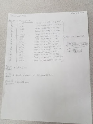
Figure 1

Figure 2


Part 2 - Calculating Mean Centers and Weighted Mean Centers

Figure 3
The three points mapped in Figure 3 are the geographic mean center of Wisconsin, the weighted geographic mean center of Wisconsin based on population from the years 2000 and 2015.  The geographic mean center of Wisconsin simply takes the shape of Wisconsin as a whole and finds the center of it.  The weighted geographic mean center of Wisconsin based on population is calculated using data that represents population spatially and in concentrations, and a center point is calculated based on that data.  The weighted geographic mean center of population shows that most people live in Southeastern Wisconsin, compared to the geographic mean center for the entire state.  The shift in population centers shows that more people are living in Western Wisconsin in 2015 than 2000.  There are several possible causes of this slight migration, or shift in population from east to west.  It could be possible that cities in Western Wisconsin are expanding and becoming more economically promising.  It could also be possible that suburbs of Milwaukee are expanding, meaning that populations wouldn't be based to the extreme southeast corner of Wisconsin, but just a little further west.  Whatever the root cause of this geographic population shift, it will be interesting to see where the weighted geographic mean center based on population changes for Wisconsin in the next 15 years and beyond.  


Thursday, February 2, 2017

Quantitative Methods: Assignment 1

Part 1

Nominal Data: Each unit of data is unique and does not have a numerical value.  These values are each given names in order to differentiate between them.  Some examples could be things like building type, vegetation type, country, etc.  The colors on the map are somewhat arbitrary and don’t have a clearly organized scale, rather there is a variety of colors just to recognize the differences between them.  In Figure 1, the colors in the map are used simply to differentiate between each type of church that is popular in that area.  The colors aren’t meant to represent some sort of scale, just each unique church type. 
Figure 1


Ordinal Data: This type of data places values in a certain order, ranked from either least to greatest or greatest to least.  Often times choropleth maps use ordinal data because they can easily use a color scale to display values in order.  In Figure 2, the author of the map used a color scale ranging from light to dark to represent places based on completeness of published architectural work. 
Figure 2


Interval Data: Continuous data is used in interval data classification.  This can be used to show differences between data values, but the interval size between values is fixed.  With interval data, a “zero” doesn’t really mean anything, it is just an arbitrarily chosen point of reference.  An example of this could be the timeline we use in history.  It is currently 2017, but humans have been around for tens of thousands of years, or more.  We chose the year Jesus Christ was born to start the common era at year 1, and anything before that is “BC” or “BCE”, and anything after that has the label “AD”.  The year zero wasn’t the first ever known year, it was just chosen as a reference point.  Figure 3 is a good example of a map using interval data.  Temperature does not have a natural zero, because there can be negative temperatures. 
Figure 3


Ratio Data: This type of data also uses continuous data, but a natural zero does exist.  This allows magnitude and comparisons to be made with different values.  This data can be mapped in several ways; choropleth maps and graduated or proportional symbol maps are common ways to map ration data.  Figure 4 shows how a symbolized map can accurately represent ratio data. 
Figure 4


Part 2

Classification Methods:

Equal Interval based on Range (MAP 1) - Each class has an equal range. 

Natural Breaks (MAP 2) - An equation is used to break the classes up by where the largest groups happen to fall in the data. 

Quantile (MAP 3) - Each class has the same number of values within it. 
Figure 5

In my opinion, the agricultural consulting company should use MAP 2 to be presented to potential clients for the purpose of increasing the number of women as the principal operator of a farm.  This map uses the natural breaks classification method in order to best display where the most female operated farms are located, as well as where they are not common.  MAP 1 which used the equal interval classification method didn’t display the information in a helpful manner because it shows almost all of the state being scarcely populated with female operated farms.  Only one county is in the highest classification, making the map too generalized.  MAP 3 does do a nice job of displaying where female operated farms are most prominent as well as where they are lacking, so it would be my second choice to show potential clients.  However, with the highest and lowest classes varying so much in range, I feel that a map with classes somewhere in the middle ground between MAP 1 and MAP 3 would be the best choice.  MAP 2 highlights just a handful of counties as containing the highest number of female operated farms while showing quite a few more areas that are lacking in female operated farms.  The entire northern part of the state could be targeted for marketing of female operated farms as well as small pockets around the state that are also lacking.  And even if the agricultural consulting company decided they wanted to target areas where female operated farms are already more popular, they could use this map to find the top 5 counties to target for that approach.